UX
UI
UX Research
UX Case Study
Crafted in 2022 for:

Real Estate Pipeline Management
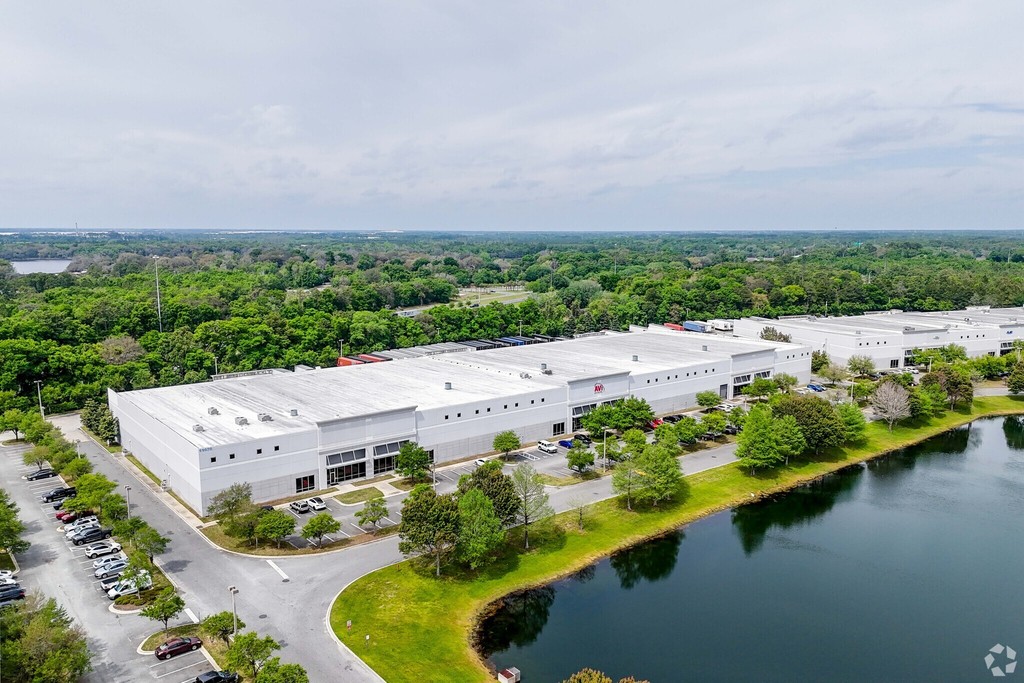
About Faropoint
Founded in 2012, Faropoint is a U.S. real estate investment firm that focuses on last mile industrial real estate. Acquiring urban distribution centers at high volume that are below the institutional radar due to size, placing the firm as one of the top buyers in their active markets.
Project Overview
Faropoint's CRM system, which I designed, streamlines transaction management and empowers portfolio managers with comprehensive oversight. It enables seamless collaboration with stakeholders and leverages proprietary data for strategic decisions and a competitive edge.

Problem Statement
Portfolio managers struggled with AtlasX's limited data integration and slow efficiency. To address this, the R&D team and I developed an autonomous system to streamline data collection and deal management.
My Contribution
As the sole UX/UI designer, I collaborated with the R&D team to create an intuitive CRM SaaS application to replace AtlasX, streamlining broker data integration and enhancing deal management with a user-friendly interface.

Identifying Personas and Aligning with Their Goals
The main challenge was designing a system that catered to diverse users and stakeholders
while handling complex data, ensuring efficient and convenient access to information.
Paige Contract
Lawyer
31, married +1

Taylor Admina
Faropoint Admin
48, married +3

Miles Acre
Portfolio Manager
42, divorced +2

Max Value
Analyst
30, married


Holden Keys
Real Estate Broker
29, single

Hover to Discover
User Familiarization Process
Without a background in commercial real estate, I embraced the challenge with curiosity. Using a user-centered design approach, I engaged with various types of users to uncover needs, hidden challenges, and insights to guide effective solutions.
My Discoveries
Talking with brokers, for example, revealed their skepticism, rooted in protecting property confidentiality. This insight helped me shape a secure, trust-building transaction upload process. Moments like these, where user insights drive impactful design, fuel my passion for exploring new fields.


How do Brokers Create a Deal Offer?
Brokers can swiftly submit offers using auto-filled data and instantly receive feedback on property eligibility based on Faropoint's criteria. This streamlined process addresses the key pain point of wasted time, making offer submissions more convenient and appealing.
Streamlining the Deal Workflow
After a property passes screening, the acquisition team collaborates: portfolio managers assess, analysts evaluate feasibility, appraisers provide valuations, and lawyers join during negotiations. Simplifying this complexity was key to designing an effective system.
Broker Case Study
Presenting data from multiple sources can be overwhelming and confusing, especially when accuracy is crucial. How could we streamline this process to ensure that the information presented was both clear and trustworthy?

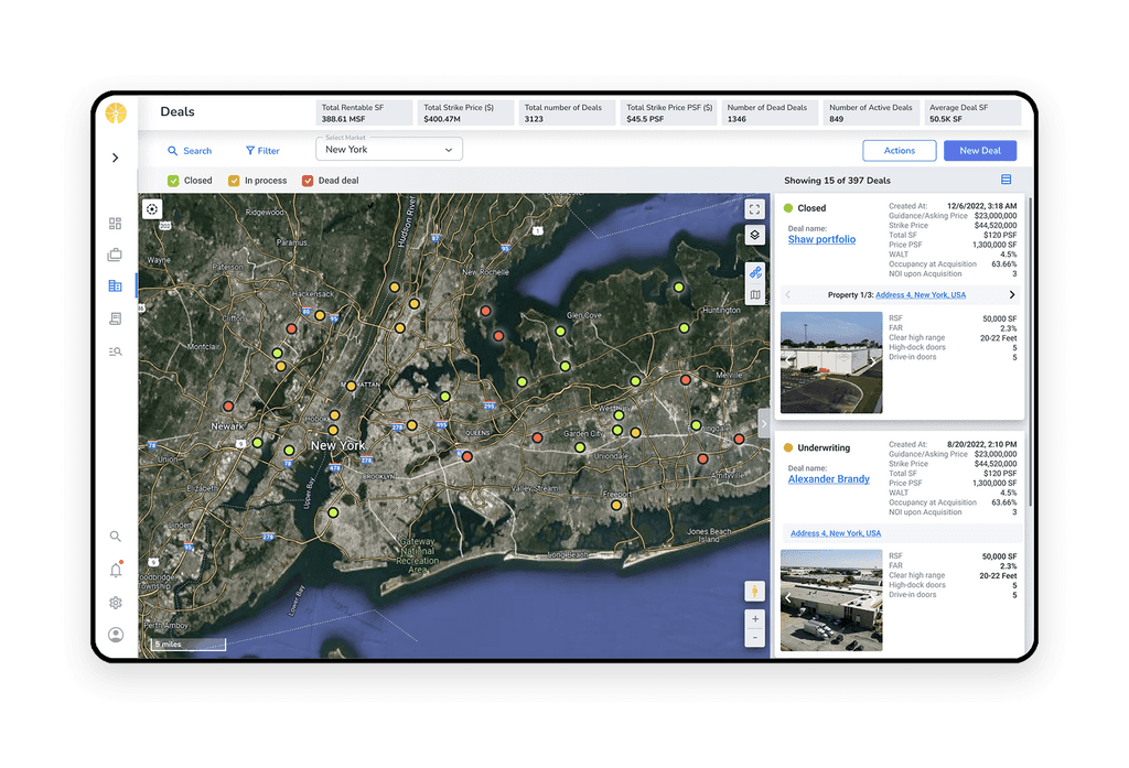
The Data Map Overview
The Data Map feature is a core component of the system, providing an interactive overview of Faropoint’s portfolio.
It showcases assets currently owned, properties suggested by brokers for potential acquisition, and other relevant assets that may be of interest for future purchases or serve as comparable properties for pricing analysis (Comps). This feature centralizes key data, offering portfolio managers a visual tool to make informed decisions.
Usability Testing Insights
To ensure the feature’s effectiveness, I conducted usability tests with property managers, including sessions focused on the Data Map. Through one-hour Zoom meetings, I observed portfolio managers as they executed tasks, gaining valuable insights into their workflow and thought processes. These sessions provided a deeper understanding of user behavior, helping refine the feature to better meet their needs.

Visualizing the Collected Data
During testing, I streamlined feedback analysis by creating a consolidated table, visible to all stakeholders, with filters for specific features, enabling clear insights and focused decision-making.
Enhancing Collaboration Through Transparency
Sharing the table with the team boosted involvement and curiosity. This transparency encouraged developers, QA, and the R&D team to actively implement feedback, leading to key improvements in the system.
Examinees:
Subjects:
#
Filter action Indication
Too much choice in the select field and lack of arrangement
Low
High
Very High
Low
Resolved
On hold
The problem:
The problem:
The solution:
The solution:
01.
02.
Problems & Solutions
Voting
Complexity
severity
Status
Comments
Total issues: 122


Filter
Table
Map
Search
Card
General


Communication is The Key to Success
In addition to keeping test participants informed through a monthly newsletter, I conducted lectures for R&D teams to highlight the value of usability testing in uncovering user needs and refining design.
Developer Engagement in Usability Testing
By inviting developers to actively participate in the usability testing sessions I conducted, we fostered collaboration and reduced frustration through better understanding of changes. This led to continuous improvements.


Evolution Over Revolution
In my UX research and usability testing, I prioritized making thoughtful, incremental changes based on user feedback. This approach allowed us to distinguish between impactful changes and mere whims, ensuring that each development step was deliberate and user-centered. By evolving the product gradually, we created a more reliable and user-friendly system.
Lorem Ipsum
By having developers actively participate in the usability testing sessions I conducted, we fostered collaboration with product teams and researchers, leading to continuous improvements and reducing frustration through better understanding of changes.
Portfolio Manager Case Study
One of the biggest challenges in a data-rich system is presenting information in a way that is both precise and accessible. Striking the right balance between clarity and functionality is essential for success. Through close collaboration with portfolio managers, we identified the optimal solution.

Evolution Over Revolution
In my UX research and usability testing, I prioritized making thoughtful, incremental changes based on user feedback. This approach allowed us to distinguish between impactful changes and mere whims, ensuring that each development step was deliberate and user-centered. By evolving the product gradually, we created a more reliable and user-friendly system.
Discovery following usability tests
After several usability tests, we realized that combining the map and table views on one screen caused confusion due to their different interaction contexts. We decided to separate them into distinct modes, making navigation more intuitive and enhancing the user experience.


Portfolio Screen Design
I designed the portfolio screen to present complex data with a clear hierarchy, organizing assets for easy navigation. Usability tests revealed the need for quick access to conversations, so we implemented an open communication panel on the right when available, while keeping it folded when not, ensuring smooth responsiveness.
Discovery following usability tests
After several usability tests, we realized that combining the map and table views on one screen caused confusion due to their different interaction contexts. We decided to separate them into distinct modes, making navigation more intuitive and enhancing the user experience.

Evolution Over Revolution
In my UX research and usability testing, I prioritized making thoughtful, incremental changes based on user feedback. This approach allowed us to distinguish between impactful changes and mere whims, ensuring that each development step was deliberate and user-centered. By evolving the product gradually, we created a more reliable and user-friendly system.
Discovery following usability tests
After several usability tests, we realized that combining the map and table views on one screen caused confusion due to their different interaction contexts. We decided to separate them into distinct modes, making navigation more intuitive and enhancing the user experience.